
Starbucks Soleil
Soleil is a unique sub-brand of Starbucks Coffee* that delivers on the promise of sustainable, high-quality coffee. Through careful consideration of both the sustainability and ethics of the farming process, this morning pick-me-up brings both humanity and the environment into the kitchens of everyday people.
Branding, Packaging, System Design
The Team:
Evan Marshall - Graphic Designer, Team Lead
Gloria Xu - Graphic Designer
Desmond Wong - Industrial Designer
Time Spent:
2 months - October-November 2020
*This is a conceputal sub-brand of Starbucks - not a real brand
INITIAL TASK & STRATEGY
INITIAL TASK & STRATEGY
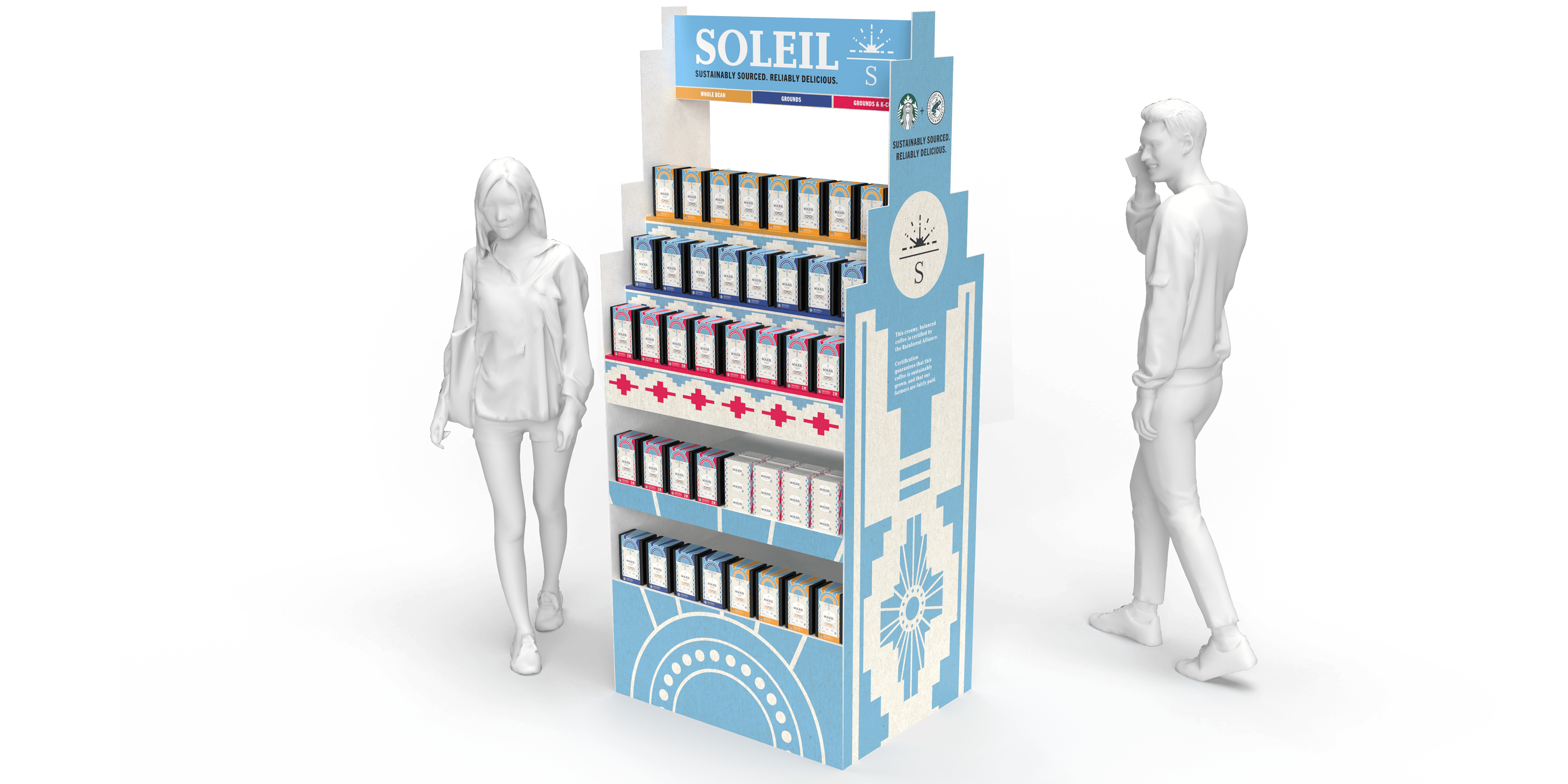
We were tasked with creating a new sub-brand under the Starbucks umbrella that had a particular focus on sustainability, and create packaging for three different forms of coffee under our new sub-brand. We were also asked to create a point-of-purchase display to show off our new sub-brand in Starbucks Cafes. As the sub-brand would promote sustainability, our packaging and display needed to be sustainable as well.
Our first step was to conduct extensive research into the current coffee market, trying to estimate our budget and the potential market size for our product. We discovered that the most receptive audience for our product would be 20-34 year-olds, with an estimated market value of $15.1 billion based on the current Starbucks market share. This research led us to our coffee itself - a sustainably sourced, medium roast, single-origin coffee from Peru that would appeal to coffee enthusiasts and new coffee drinkers alike.

THE SOLEIL PROMISE
We chose to name our sub-brand "Soleil", which is the French word for "Sun". Inspired by how we wanted our coffee to help consumers rise like the sun and brighten their day in the morning, this name quickly took on a deeper meaning for us. It grew to become a promise - to work together alongside our growers and their communities to create a better future.
This promise would go on to inspire our slogan.

VISUAL IDENTITY
Starbucks already has a well-established visual presence in the coffee market, so we wanted to tap into that prowess a bit. Soleil takes inspiration from some of Starbucks' more premium blends and lines, but shapes it to have a more environmentally-focused appearance, featuring a rising sun in the logo with packaging made from materials that are both easily recyclable and very reusable.
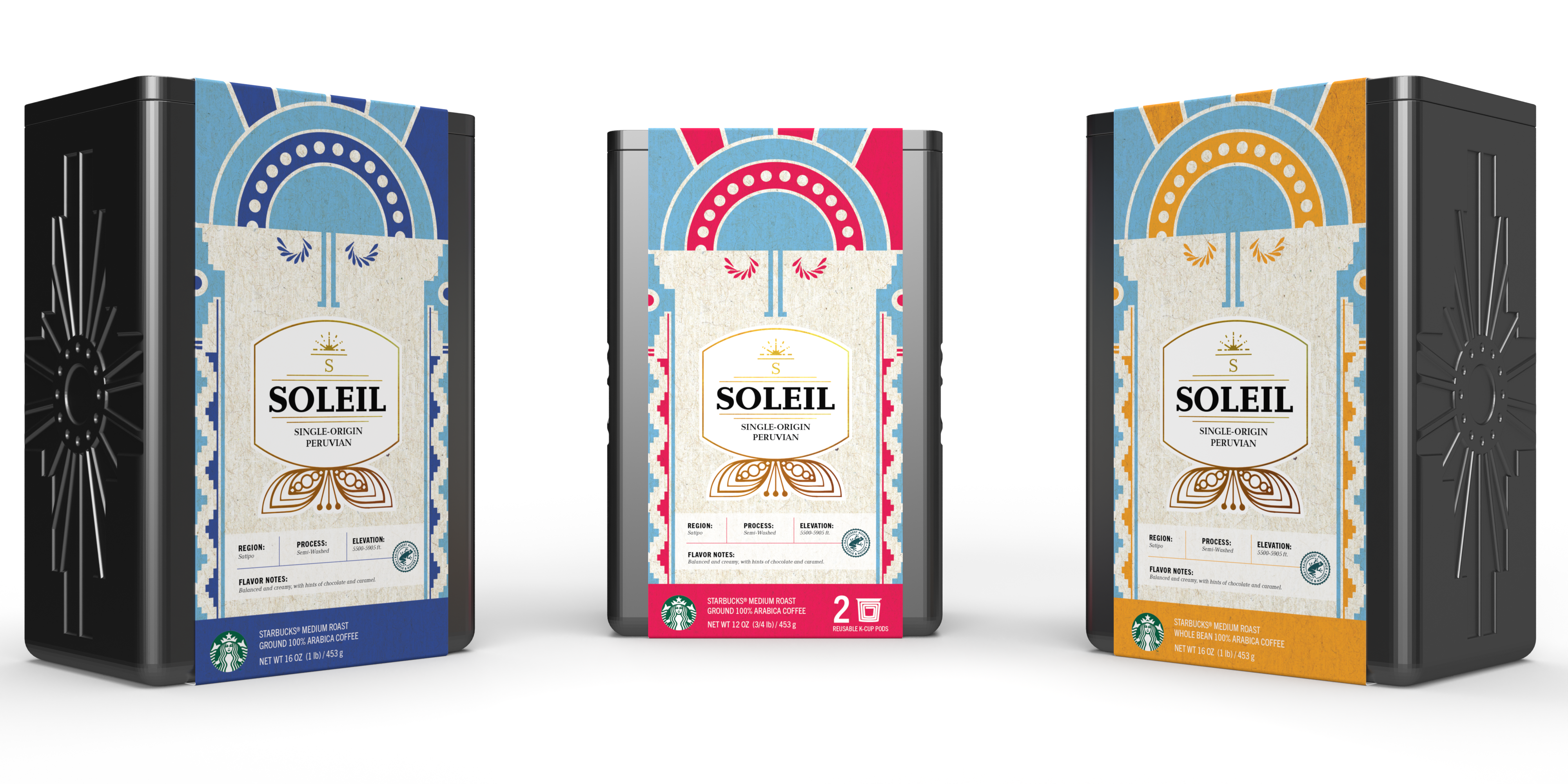
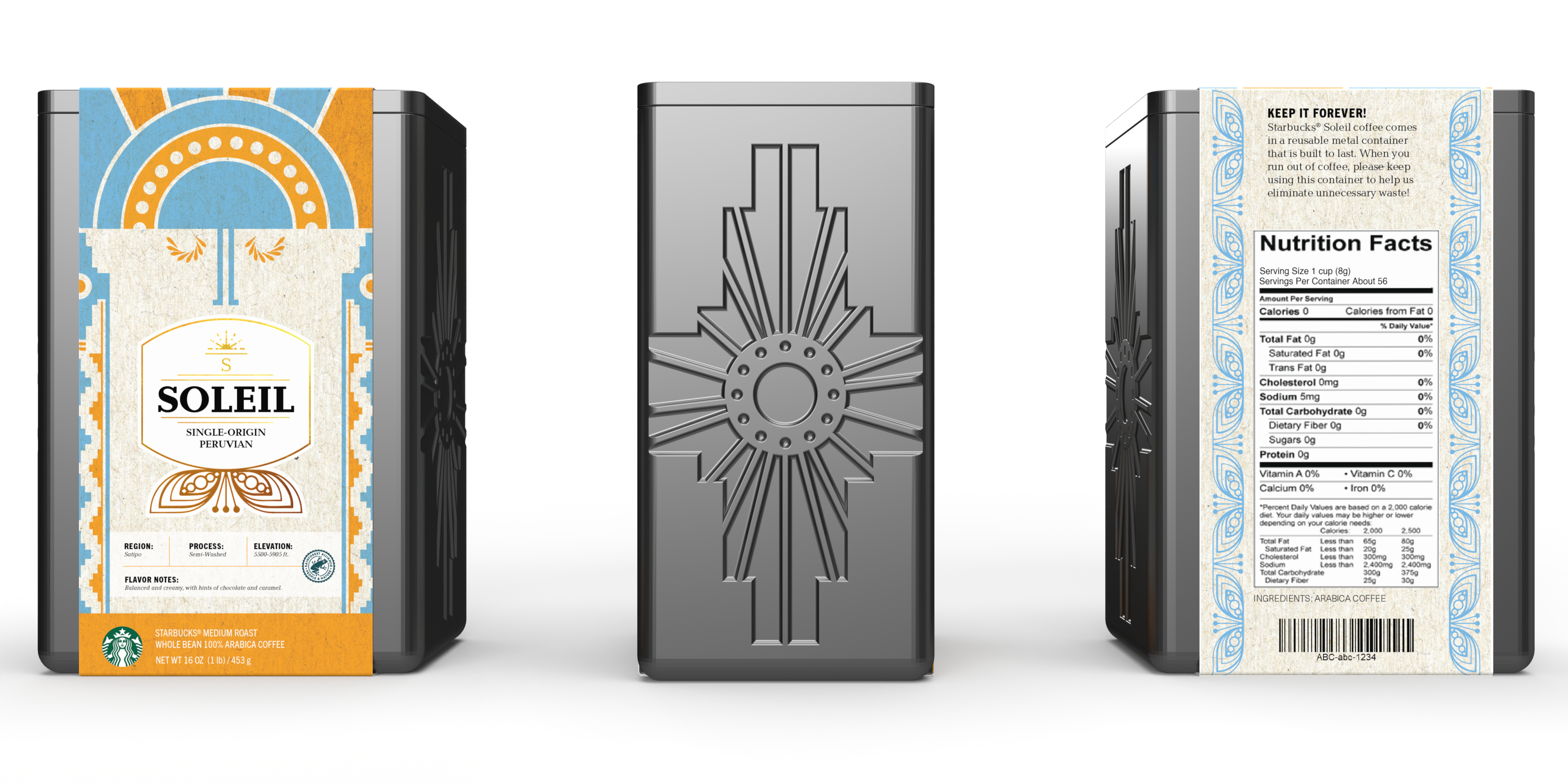
Our designs take inspiration from the regions where our coffee grows. This first roast comes from the mountains of Peru, and we were inspired by the fabrics and textiles that are so prominent in Peruvian culture. These colors and traditional patterns became the inspiration for our graphics, with the primary panels bearing faces inspired by ancient depictions of the Inca sun god, Inti.
We also introduced a color-coding system to help consumers find the type of coffee that they were looking for on our point-of-purchase display. A clearly labelled key on the front-facing top panel of our point-of-purchase, as well as color-coding to match on the shelves as well, allows consumers to find their choice of coffe forms quickly and effectively.
LOGOTYPE & LOGO

SUSTAINABILITY STRATEGY
When it came to deciding on our materials for packaging the coffee, we wanted to create something that was more than just a box. We decided to focus on creating less waste overall by minimizing the disposable aspects of our package, and focusing on durable and reusable materials that consumers could keep in their kitchen and continue to use for a long time.
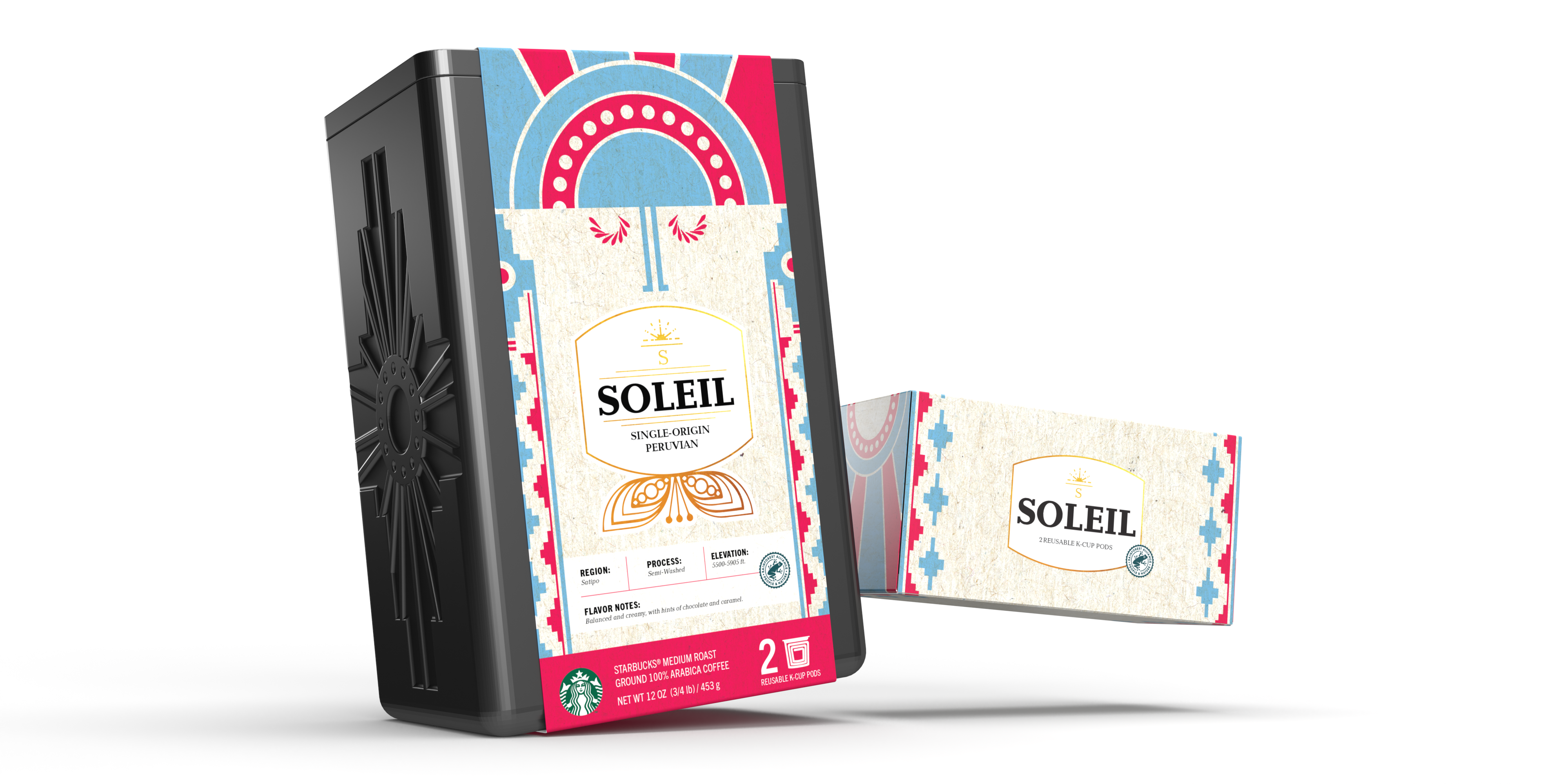
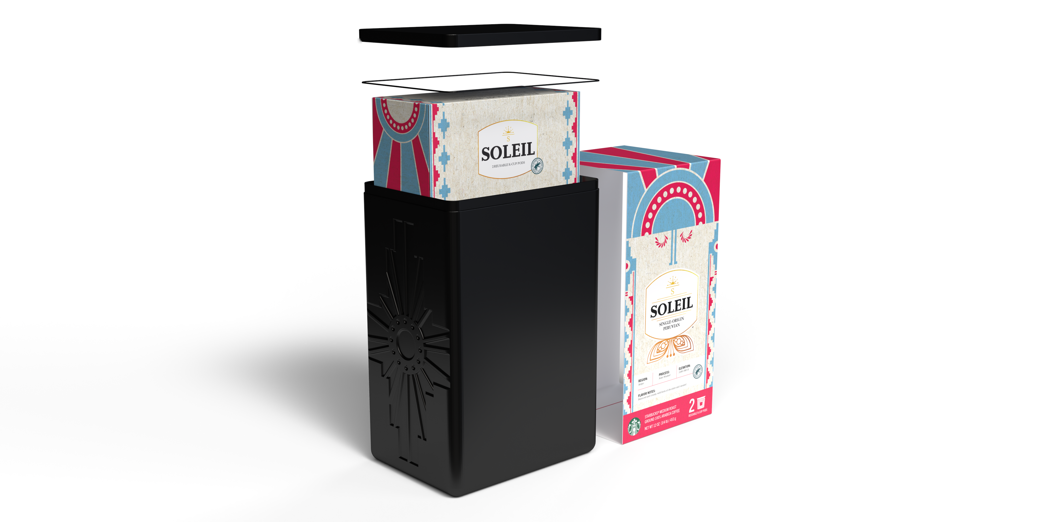
The most prominent aspect of our packaging is the tin itself. Our containers are made of food-safe stainless steel, with a rubber gasket forming an airtight seal around the lid to keep the coffee fresh. The container is embossed with a graphic inspired by Peruvian textiles, which makes it more desirable to consumers. These would be run in a limited number and would change every time the Soleil coffee changed, creating a collector's piece that consumers could use over and over again in their everyday lives.
We also opted to include reusable K-Cup pods instead of single-use pods, which allows our consumers to limit the plastic waste they create as a part of their usual morning routine. The paperboard boxes for these pods, as well as the graphic bands that seal the coffee containers shut and the point-of-purchase display, are all made from recycled, unbleached fibers and are printed with soy ink. This ensures that any part of the packaging that consumers can't reuse, they can recycle.
FULL PROCESS DECK
CONTACT: +1.650.996.2568 | emarshall.designs@gmail.com
Copyright © 2023 Evan Marshall
CONTACT:+
+1.650.996.2568 emarshall.designs@gmail.com
Copyright © 2023 Evan Marshall
